Wednesday, May 18, 2011

forced perspective


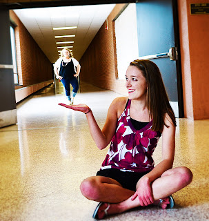
For this forced perspective image I set my f/stop to a large number to create a great depth of field. I then had Nash stand far back on the slanted floor and emma close up to the camera with her hand out as if Nash were standing on it. For editing, I created a gaussain blur around the outside and sharpened the image on the inside of the photo. I also boosted the colors and brightened it up.
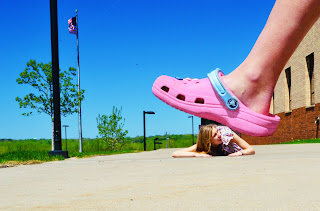


For this forced perspective image I set my f/stop to a big number to create a great depth of field. Then I had paige lay down on the ground far away from the camera and had Emma's foot close to the camera to make it look like she was stepping on her. As for editing, I didn't do too much for editing other then boosting colors and brightening it up.

This assignment went well. It was sometimes difficult to get your pictures to turn out how you wanted them, but I just kept trying and eventually got more then 10 to work out. The editing was easy becuase I just used simple edits to not distract from the craziness of the photo.

Tuesday, May 10, 2011

changing color schemes


analogous primary

For this assignment we changed the colors in out photos to go better with the color scheme we were trying to achieve. To do this we would create a new fill layer then change it to the new color we wanted. We would hen change the blending mode so it looked realistic. After that we used a layer mask to make it so the new color was only on the part of the photo we wanted to change and not the whole thing. For the first picture it was supposed to be analogous, but the ground was more gray then green, and the sky wasn't a very noticeable blue. So I ended up using three different fill layers to make the flower more yellow, the ground more green, and the sky more blue. For the second picture, the color scheme wasn't very noticeable so I decided to change it to primary by making the flower red, the sky blue, and the writing and light on the sign yellow.


This assignment went over well. Taking the pictures were difficult to take because you had to find correct color schemes, but once you used photoshop you could alter it and make it more noticeable. Also the techniques we used to alter it weren't hard to use or figure out at all so it went very well for me.

Thursday, May 5, 2011

color and mood

The three main colors in this picture are blue, yellow, and green. I enhanced the photo to make the main colors the focus. With these three colors being the main focus. The green creates a healthy, new, clean mood. The yellow creates a cheery, lively, uplifting mood. And the blue creates a fresh, hopeful, honest mood. Adding all these together I tried to create a happy and new, spring mood after the long winter.